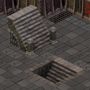
Dungeon Stairs
I’ve been planning several key additions to Flare’s core tile sets — we want game designers to have the proper assets to create interesting maps.
This weekend I created these Dungeon Stairs:
Here are some various thoughts on creating these.
Inspiration
It took me forever to decide on a style for the stairs. I need to get into two habits to fix this. One is fearlessly doodling — in the age of Ctrl-Z it’s intimidating to put pencil to paper and commit something. I need to get over that and sketch way more. Really if I want to improve as an artist I should pick up sketching every day.
Second, hunt down reference material. It’s not automatically infringement to take inspiration from history, from architecture, even from interesting concepts of other artists. I need to start collecting more reference material. I have a couple folders of inspirational images for future works (lots of old ruins, and lots of armor designs) but I should expand on that. Maybe even pick up some coffee table books. Perhaps start poking around concept art communities online.
Modeling
I told myself recently that all new models I create should be of a higher standard — able to be used in 3D games, even if I only need them on a small scale. That didn’t work out here. I finally gave in and took shortcuts for good reasons. Most 3D games can’t just take any old stairs and slap them into a game. Stairs, more than most other world objects, are tied very closely to game/engine design. Step sizes have to match animations. Stair height depends on the size of floors. In my simple 2D game I have none of those concerns, so making a complete 3D model would be impossible without proper spec.
After giving in to sloppy modeling, I actually landed upon some new techniques. Notice the brown wall of the stairs. It’s basically a flat polygonal area with a simple texture on it. But I’ve added highlights in the form of random bricks poking out. These are resized cubes with the back face removed, using the same texture as the wall, and placed near the wall (not actually attached in a manifold way). By varying their placement and thickness, it gives the impression of an interesting unfinished wall. It’s a nice effect that requires very little modeling time. It might even work in a 3D game asset, unless a particular engine requires manifold structures.
Design
The size and layout of the stairs has a mechanical purpose. In Flare the hero’s position is a single 2D point — the hero doesn’t have a thickness/radius when it comes to collision. So you’ll notice that walls tend to take up half of a tile instead of going entirely to the edge. This visual trick looks good and keeps collision code very simple.
So when designing the stairs, I finally realized that I needed to account for this wall-edge gap in the design. I decided the stairs needed to take up a 4×4 tile area. This contains a 1-tile perimeter that is “Wall collision” to the engine, except for a 2×1 tile area that is the stairs entrance. That 2×1 area is where the teleport event goes. Because I’m using whole tile collision, it’s important for these large tile sets to play nicely with the tile grid and with player expectations.
The look and feel of the stairs is simple, but evolved into a happy accident. I wanted that archway under the stairs, but after adding the prison bars it really gave the piece that “dungeon” feel to match the tile set. The hanging chains add to the theme as well.
Notice the top of the up-stairs is slightly brighter than the floor tiles. The bottom of the down-stairs is darker. These are point lights in Blender added specifically to make them stand out from surrounding tiles. The down-stairs tile uses a “negative” light which casts darkness. It’s one of those neat shortcuts possible in 3D modeling that doesn’t happen in real life lighting.
I put some effort in to make the steps irregular. Some are moved out of position, a couple are broken, some have a worn off edge. I’m still learning these techniques via trial and error. Next time I think I need to go way further in adding lots of wear and tear onto models like this.
Once again I used pdtextures.blogspot.com for the textures — it’s a resource that keeps on giving. I’ve uploaded the Blender model to OpenGameArt under the CC-BY-SA license. Enjoy!

